Quiz artwork
Artwork accompanies lobby, feedback and celebration messages. Text carries the meaning; answer pads keep their simple shapes. Every image is rendered by name through QuizArt.
Characters and objects · 27
- correct-badge
- crown
- empty-box
- flame
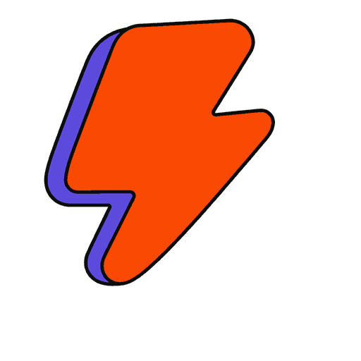
- lightning-bolt
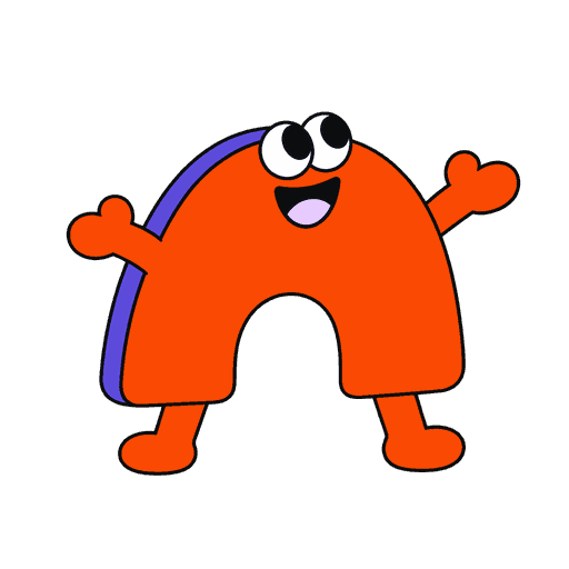
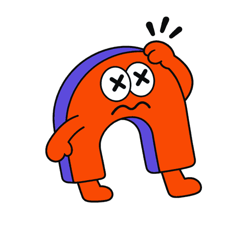
- mascot-arch
- mascot-celebrating
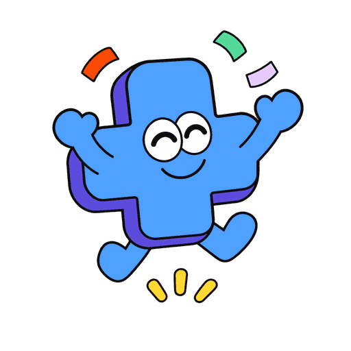
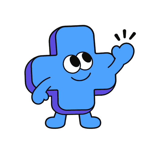
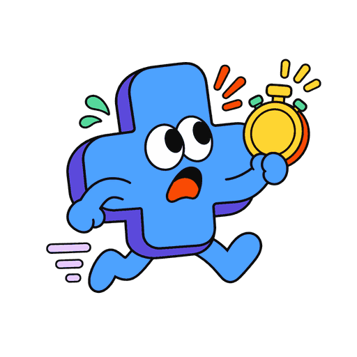
- mascot-cross
- mascot-oops
- mascot-out-of-time
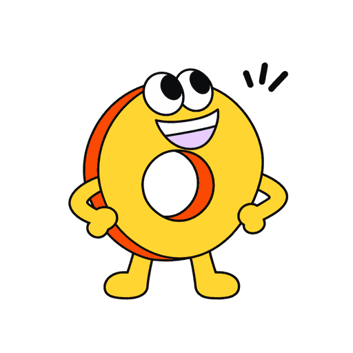
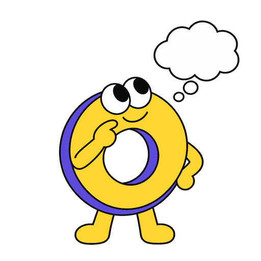
- mascot-ring
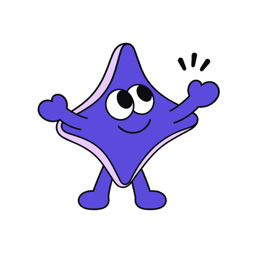
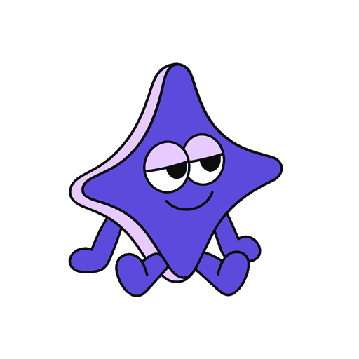
- mascot-spark
- mascot-thinking
- mascot-waiting
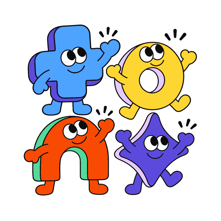
- mascots-together
- medal-bronze
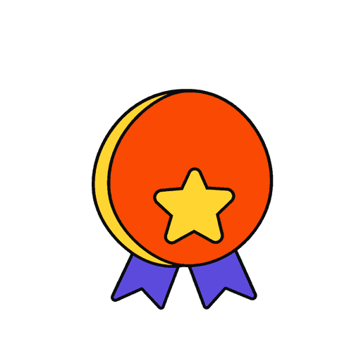
- medal-gold
- medal-silver
- megaphone
- party-popper
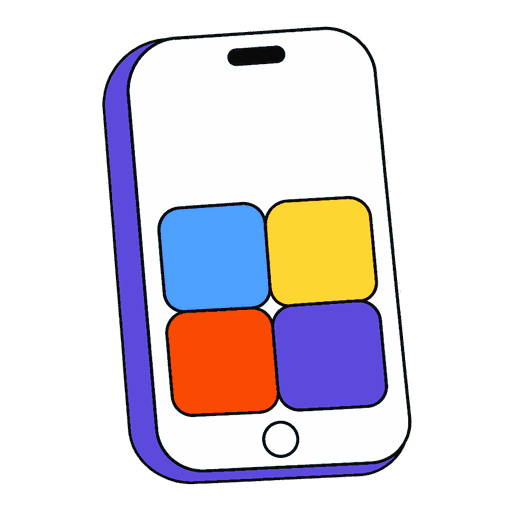
- phone
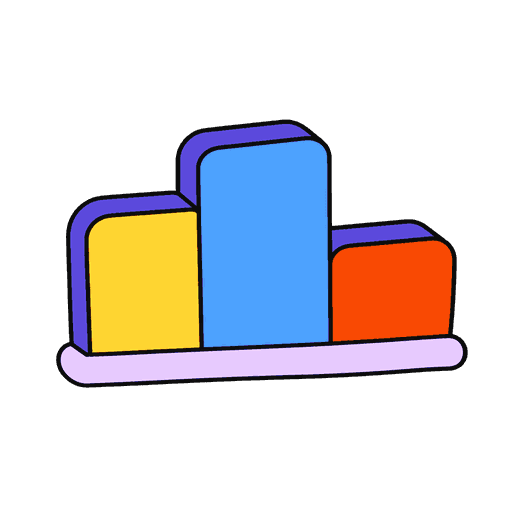
- podium
- points-burst
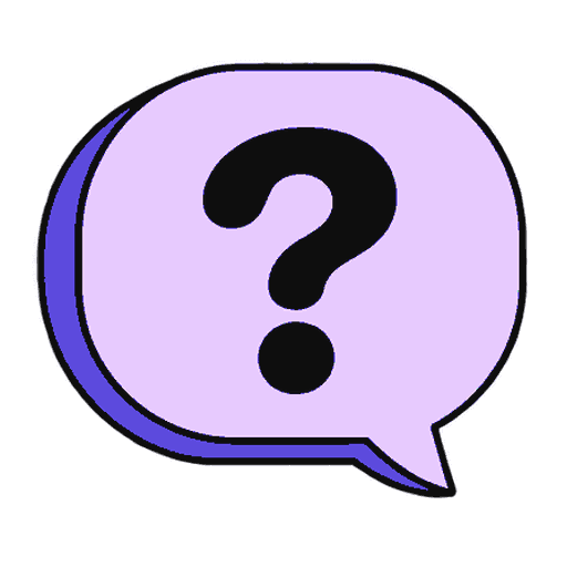
- question-bubble
- stopwatch
- trophy
- wrong-badge


Confetti · 21








Sparkles · 5




Doodle marks · 8


Streamers · 3
Ribbon · 1